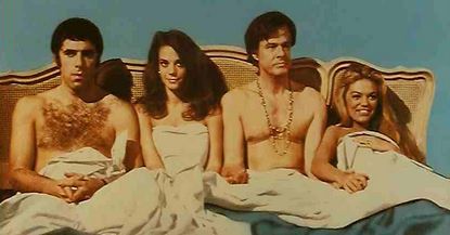
Book Cover Design Motifs
Throughout your life, educating yourself should never stop. That goes double for your writing career. While I’m setting up the Career Indie Author site and working on the book, I’m also paying attention to what other authorities have to say.
Which is why I saved these screenshots. It was a part of one of Mark Dawson’s Self-Publishing Formula seminars Stuart Bache’s cover design course. I thought it was very amusing and instructive to see these book cover tropes and how efficiently they signal the book’s subject matter.
I had saved them to my desktop, so to clear them off, I decided to pass a few of them along to you.
Take the Running Man motif. Dark streets. Concerned man, sometimes accompanied by the second banana. Instantly signals conspiracy, thriller, threats, and the impossibility of finding a taxi in the days before Uber.

The Single Eyeball motif. This is more difficult to parse. Depending on the type and color of the eye, it signals the presence of monsters, aliens, or otherworldly presences. Think thriller, horror, or astigmatism.

The Split Legs motif. This you see more on movie posters than books, so you might want to consider this. I remember seeing it first in the post for James Bond’s You Only Live Twice. In Charlotte, N.C., the newspaper had to add a skirt to hide the cheeky woman’s cheeks. What started as provocative for a run-of-the-mill Roger Moore movie has since morphed into a symbol for a sex comedy, usually with a lot less sex or comedy than promised.

The Face Vandalism motif. Words over the face. Any color, any face, but almost always a serious Oscar-bait story featuring an A-list actor (for the movie poster, see Matt Damon and Nicole Kidman in the photo). I also see it used over Diane Keaton in “What’s the Story Morning Glory?” a semi-serious comedy with Harrison Ford that’s better than I thought the reviewers said. Typography is especially important here, to make the title recognizable instead of implying “Elephant Man” disease.
The Beddy Bye motif. The characters are in bed, facing the viewer. By the gender combination (male / female, male / male, human / animals) instantly signals the genre, and their expressions whether it’s drama or comedy. Usually seen on movie posters (such as “Bob and Carol and Ted and Alice” seen at the top of this post), but why not appropriate it for novels?
The last shot demonstrates how cover designer Stuart Bache creates an original piece of art by combining several elements from photos found on royalty-free sites such as Shutterstock or DepositPhoto. Creating a collage-style cover can be tricky. A look at Lousy Book Covers demonstrates the perils of designs in which the elements are out of scale, badly cropped, or out of focus.
The cover design seminar was incredibly engaging. Even if you don’t want to do your own designs, the full course should give you the knowledge so you can approach a designer and make educated suggestions that will nail your novel’s genre and encourage readers to try your book.
